The Problems
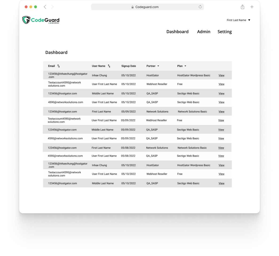
CodeGuard internal dashboard shows very detailed customer’s website backup status and this is what support agents use to help customers out. With the increased number of registered accounts, support agents' performance decreased significantly.
My Role
I was responsible leading the entire design process for this project, including the initial discovery, research, design ideation and hand off to developers.
Before & After
Dashboard
Before
After
Website view
Before
After
Metric
After
Goals
The main people who will be using the internal platform are the admin/customer support teams.
Pain Points & User Story
To understand the current pain points, I interviewed a few stakeholders, customer support agents, and developers and I discovered the below list.
The internal platform is not scalable. As this internal platform was built by engineers whenever the feature was requested, it only caters to them. Since the number of customers is increasing, this platform became a huge data storage place where it’s so confusing to find information.
Lack of visual hierarchy and navigation. The platform layout feels like a giant maze without a clear direction. Certain flows are not obvious and this can cause frustration for users while they are using this to help customers out.
Inconsistent Metrics. The existing metric feature does not provide any information. Navigating between metrics and reports that do not provide proper info can be confusing.
Overall, the platform needs to be polished with improved UI.
User Flow
I created more refined user flow that shows
User searching for partner’s list from the dashboard,
Generating metrics
Searching for a customer from the partner’s page.
This captures the entire searching partners & customers info process from the partner’s dashboard page.
Low Fi Designs
I explored few different ways to address all the pain points listed above. Low fi wireframes are shared with the team to talk about my design decisions and discussed to find the best option to integrate in our platform.
Dashboard
Outside vs Embedded Filters
Filters outside the data table display tags underneath once filtered. From the visual tag, the user would be able to easily adjust the setting. However, I opted for embedded filters for a few reasons.
Embedded filters take up less space in the dashboard page which helps with the scalability
It was a better way to show multiple filters in one space
Indicating how many filters are applied under each header seems much more intuitive
Website View
View All (websites) is a default setting. From here, users can click the drop-down or data table to choose a specific website that they want to see more in detail.
The top dropdown allows the user to choose the list of websites without going back to the default page
Sub nav menus are vertical and also collapsible for the scalability reason
The only concern was when the menu is collapsed state, there’s no way for the user to know what to choose
Metrics
Tile tab vs dropdown
At first, the tab menu (to choose the metric category) was ideated, but I opted for the drop-down menu for a few reasons.
The Tab menu can’t contain more than 4 categories
It takes up a chunk of space on top
Having a double-tab menu ( from the main tab to the category tab menu) can be confusing
Metric and Reports displayed top to bottom flow for visual hierarchy and also it gives more real estate for users to conduct any actions
Hi-fidelity Designs
After many different iterations and meetings with engineers and other stakeholders, our team decided it addressed initial problems and pain points. Hi-fidelity designs were delivered to engineers.
The design is in the process of development. Our team felt confident that this design solves the initial problems, pain points, and other things below.
Overall the design matches the existing branding and is more polished and refined
It serves our users (Internal support & admin) to achieve their goals
More intuitive in terms of scalability therefore it’s more engaging
Dashboard
The main feature, search, and filter, will help users to speed up the process. Also, immediate actions can be taken under each different status without going into the page.
Website View
Under each website URL page, it shows the customer information and all the websites that belong to the customer.
From both drop-down and data table, the user can access each website URL page.
Metrics
Users can choose different categories under the drop-down menu. Now users don’t need to go to different pages to find report documents.
Style Guide
Key Takeaway & Challenge
Always keep in mind scalability. Since the new dashboard is meant to display heavy data information (at least over +500k websites), It was important to keep in mind the scalability and critical to communicate with engineers and other stakeholders about technical constraints or any other regulations.
The ultimate goal for this platform was to combine it with the SiteLock product. It was crucial to keep in mind SiteLock's layout, components, and other external resources so eventually, the merge of the two products can be as smooth as possible.


